
Intro
Colour is an experience, not an isolated material property
We naturally speak of a blue fabric or a red thread as if colour were contained entirely within the object. In reality, the colour we see is produced by three components: the light source, the object and the observer. Change any one of them and the colour impression may change. This is why professional colour communication requires both an understanding of human perception and standardised measurement.
1. The light source
Visible light consists of different wavelengths, which we perceive as different colours. A light source determines which wavelengths are available to illuminate a sample. Daylight changes over the course of the day, while artificial sources have their own spectral characteristics. If a wavelength is weak or absent in the light source, a material cannot reflect much of it. The same textile can therefore appear warmer, cooler, brighter or duller under different lighting.
2. The object
When light reaches a material, some wavelengths are absorbed and others are reflected. The reflected light enters the eye and contributes to the colour impression. Perfect white would reflect all incoming visible light, while perfect black would absorb it. A coloured object absorbs selected wavelengths and reflects others.
Colourants are important, but they are not the only influence: fibre type, yarn construction, surface texture, gloss, pile direction, translucency and sample size can all change the way light is returned to the observer.
This has clear implications for thread selection. A matt core-spun thread and a glossy continuous filament can have similar measured colour coordinates but create different visual effects. Trilobal filaments, used for brilliant embroidery threads such as Isacord, increase light reflection and gloss. Metallic threads interact with light differently again. The desired match must therefore consider not only colour but also appearance.
3. The observer
The retina contains rods and cones. Rods are highly sensitive at low light levels but do not provide normal colour discrimination. Cones support colour vision through responses to different wavelength ranges. The brain combines these signals and interprets them in context. Colour is therefore not a direct copy of the physical world; it is a perception constructed by the visual system.
That interpretation is affected by adaptation, visual fatigue, colour-vision differences, surrounding colours, viewing angle and expectations. A grey area can appear warmer or cooler depending on its background. A colour displayed over a large area may appear stronger than the same colour on a small thread sample. The brain can even compensate for an overall colour cast and make neutral areas seem coloured. These effects explain why well-trained observers can still disagree and why viewing conditions must be controlled.
Describing colour objectively
Everyday colour names are useful, but they are not precise enough for industrial communication. Terms such as navy, petrol or warm grey can refer to many different shades. Three basic attributes provide a clearer description:
- Hue: the colour family, such as red, yellow, green or blue.
- Lightness: how light or dark the colour appears.
- Chroma: the purity, intensity or saturation of the colour.
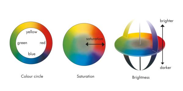
Instrumental colour systems translate these attributes into numerical coordinates. The reflectance curve provides the spectral basis, while colour-space values allow samples to be compared and tolerances to be defined. This does not make visual assessment obsolete. Rather, it gives trained observers an objective framework and permits colour decisions to be reproduced beyond a single person, location or moment.
Colour gamut and material limitations
The human eye can perceive a wider range of colours than many devices and materials can reproduce. Screens create colour with emitted red, green and blue light; printing uses inks; textiles rely on fibres, dyes and finishing processes. Their colour gamuts differ. A brilliant screen colour may not be achievable on cotton, paper or a particular thread construction. Polyester may permit a different brilliance than cotton, and gloss can make a colour appear more saturated. Recognising these limits early helps teams select achievable colours and avoid repeated correction cycles.
Good practice for reliable colour decisions
- Evaluate the original material rather than relying only on screens, photographs or printouts.
- Use standardised, relevant lighting and a neutral medium-grey background.
- Keep the sample size, orientation and viewing angle consistent.
- Allow the eyes time to adapt and avoid making critical decisions when visually fatigued.
- Compare both colour and surface appearance, especially for glossy, textured, metallic or translucent materials.
- Use instrumental data to support communication and document the decision.
- Test critical combinations under the conditions expected in production, retail and use.
From perception to controlled quality
Colour will always have a perceptual dimension. The goal of professional colour management is not to remove the human observer, but to control the conditions that influence perception and to add reliable measurement. By combining colour science, digital tools and textile expertise, AMANN helps customers make colour decisions that are clearer, faster and more consistent—from initial selection through production and final application.
Quick facts
| Property | Value |
|---|---|
| Topic | Colour Perception and Colour Science |
| Main focus | Understanding how light, materials and the observer influence colour |
| Three components | Light source, object and observer |
| Key colour attributes | Hue, lightness and chroma |
| Scientific basis | Light wavelengths, reflection, absorption and human vision |
| Material influences | Fibre type, yarn construction, surface texture, gloss and translucency |
| Colour measurement | Reflectance curves, colour-space coordinates and defined tolerances |
| Key challenge | Different materials, devices and lighting conditions reproduce colour differently |
| Best practice | Combine standardised visual assessment with instrumental measurement |
| Industry relevance | Reliable colour communication, thread selection and consistent production quality |
Also known as
Technical terms
- Colour perception
- Colour science
- Colour theory
- Colour measurement
- Colour appearance
- Colour attributes
- Colour spaces
- Colour gamut
- Spectral reflectance
- Visual colour assessment
- Textile colour perception
- Colour matching in textiles
- Colour consistency
Colour communication
Common descriptions
People often search for:
- What is colour perception?
- How do humans perceive colour?
- How do light, materials and the observer influence colour?
- Why does the same colour look different under different lighting?
- What are hue, lightness and chroma?
- How is colour measured objectively?
- What is spectral reflectance?
- What is a colour space?
- What is the difference between visual and instrumental colour assessment?
- Why do colours look different on screens and textiles?
- What is colour gamut in textile manufacturing?
- How do fibre type and yarn construction affect colour appearance?
- Why can two threads with the same colour values look different?
- How can textile manufacturers improve colour consistency?
How should textile colours be evaluated under standardised lighting?
Alternative terminology
Different industries and software providers may use slightly different terminology.
- Colour matching
- Colour management
- Colour tolerances
- Standardised lighting
- Metamerism,
- Colour difference,
- Reflectance spectrum
- Surface appearance
- Textile materials,
- Digital colour communication
- Instrumental colour measurement
International terminology
| Language | Common terminology |
|---|---|
| English | Colour perception, colour science, colour measurement, colour matching |
| German | Farbwahrnehmung, Farbenlehre, Farbmessung, Farbangleichung |
| French | Perception des couleurs, science de la couleur, mesure des couleurs, harmonisation des couleurs |
| Italian | Percezione del colore, scienza del colore, misurazione del colore, abbinamento dei colori |
| Spanish | Percepción del color, ciencia del color, medición del color, igualación del color |
| Chinese | 色彩感知、色彩科学、颜色测量、颜色匹配 |
| Vietnamese | Nhận thức màu sắc, khoa học màu sắc, đo màu, phối màu |
FAQ
-
Colour perception is the way the human visual system interprets light reflected or emitted by an object. It depends on the light source, the object's properties and the observer. This means colour is not simply an isolated property of a material.
-
Different light sources have different spectral characteristics. Daylight and artificial lighting may contain different proportions of wavelengths, changing the light reflected by a material and therefore its perceived colour.
-
These three attributes help describe colour more precisely. Hue identifies the colour family, lightness describes how light or dark it appears, and chroma describes its intensity or purity.
-
Fibre type, yarn construction, surface texture, gloss, pile direction and translucency all influence how light interacts with a textile. As a result, two threads with similar measured colour coordinates may still look different.
-
Visual assessment relies on human perception under defined viewing conditions. Instrumental assessment uses measurement devices to produce numerical data, such as colour-space coordinates and reflectance curves. Combining both methods supports more consistent and reproducible decisions.
-
A colour gamut is the range of colours that a particular device or material can reproduce. Screens, printing inks and textile materials have different gamuts, so a colour displayed digitally may not be achievable in a specific thread or fabric.
-
Lighting, background colours, viewing angle, sample size and visual fatigue can all influence colour perception. Standardising these conditions reduces variation and helps different people and teams assess samples more consistently.
-
Manufacturers can combine standardised lighting and visual assessment with instrumental measurement, consistent sample preparation and documented colour tolerances. They should also consider surface appearance and test critical colour combinations under relevant production and application conditions.